

Drop down menu
All applications using the default surrounding page in the CrossmarX Application Engine have a drop down menu at the top of every screen. This menu allows the user to navigate through the application in an easy and straightforward manner.
Menu bar
When an application starts for the first time, all options for the current user are automatically shown in a menu bar without a hierarchy. All classes and session actions that are relevant for the current user are displayed. The following rules apply:
-
Only classes with search and insert permissions set to yes are shown.
-
Only session actions with permissions set to yes are shown.
-
Since users with user group type "super" have permissions on all classes, you can hide a class from the main menu by unchecking the property "On main menu" for this class on the tab "Permissions".
Menus
When the application grows, it is wise to add a hierarchy to the main menu. One might want to add urls that direct to specific pages in the application or even add self-defined urls directing to other web pages. By clicking the "Menus" pictogram in the application backstageistration, a screen will open in which a new menu can be made, and existing menus can be edited. For example, the definition of the default menu can be accessed here by clicking on the "default menu" row.
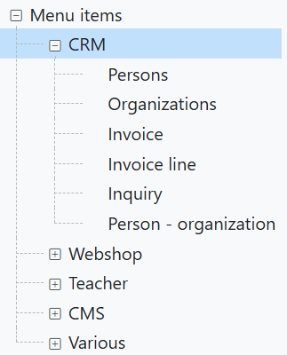
Structuring the drop down menu
An important button when viewing the menu details is the "View/edit menu items" button, used to structure the drop down menu. When clicked, the left part of the screen shows the menu structure displayed as a tree and some buttons to modify the tree. If no menu items have been defined yet, only the root of the menu tree is shown. The root itself is never displayed in the menu and has no detail page. For example, when accessing the default menu for the first time, since there aren't any items yet, the right part of the page is initially blank.
With the button "Insert item as child" you can insert menu items. The first menu item will always be a child of the root. As soon as the first item is defined you can now insert items above, below or as child of the current selected item.
When an existing menu item is selected or a new one is created, the details of the menu items are displayed at the right part of the screen. Here, a label should be set. The "position" value defines the position of the item in relation to other items that share the same branch of the tree. What each menu item does when selected in the application depends on the settings in the detail screen:
A class
When you define a class, selecting the menu item opens a starting window of the class manager. In most cases this is a search window. If you want another window, you should set a value for Class action. There are four options:
-
search: a search window opens.
-
new: a class manager detail window opens to enter data of a new object.
-
open: a class manager opens with the details of a specific object. In the field Item (id) you have to enter the key value of the object you want to open.
- run query: execute a query.
An action
When you define an action, selecting the menu item starts the action.
A query
Selecting the menu item executes the query immediately.
A URL
Selecting the menu items executes the URL and shows the resulting page. When you select an URL you can also define the relevance per user group.