

-
-
- Search Engine Optimization
- OTP
- User Interface migration guide
- User account management
- Instructies voor implementatie van visueel editen van nieuwsbrieven
- Login as another user
- Support
- More information about moving to User Interface Version 4.0
- Standaard page layout
- Sections moved to layout
- Aanpassingen in release 2024-7
- Media library
- Aanpassingen in release 2024-10
- Analytics and Matomo
- Registration forms
- How to change names of classes and fields?
- Responsible Disclosure Policy
- How to upload a blob in Velocity?
- Aanpassingen in release 2024-2
- Instances
- Componenten in onze technologie
- Google Analytics
- Street and City helper (postcodecheck)
- Responsible disclosure-beleid
- Postcode check service (straat en huisnummer) kosten
- Expressions
- Regular Expression Reference
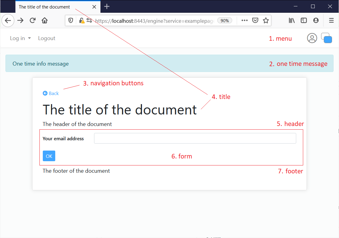
Standaard page layout
From user interface 4.0 the default layout for a window is as follows.
- Global menu
The global navigation of an application is always on top of the document. On a mobile device the menu is displayed as a 'hamburger'. The menu will always stay in top of the visible part of the window. - One-time message
A message that has to be displayed to ths user only once. - Navigation buttons
Might contain a back button, but als a previous or next button when the source of this document is a table with records. - Title
Preferably every document has one main title. By default this title is also used on the tab of the browser. In html-terminology it is set as the title-tag and as the h1-tag. - Header
The next position can be a page header. This is optional. Might contain html. - Form
The next position is a form to communicate content with the user. - Footer
The next position can be a page footer. This is optional. Might contain html.
More details on the form
The form has the following elements.
- Error message block
At the top of the form a block is reserved for error messages. There are three ways this block is used:
- Minimal
The block is only used when there is no other option to communicate an error message - Message only
If there is at least one error, the block is displayed, but details are displayed as much as possible below the concerned fields - All
If there is at least one error, the block is displayed, and contains all errors
- Minimal
- Paragraphs and tabs
All content of the form can be organized in seperate containers, such as tabs and paragraphs. These containers might contain field groups and tables. - Button row
Buttons are positioned at the button of the form.
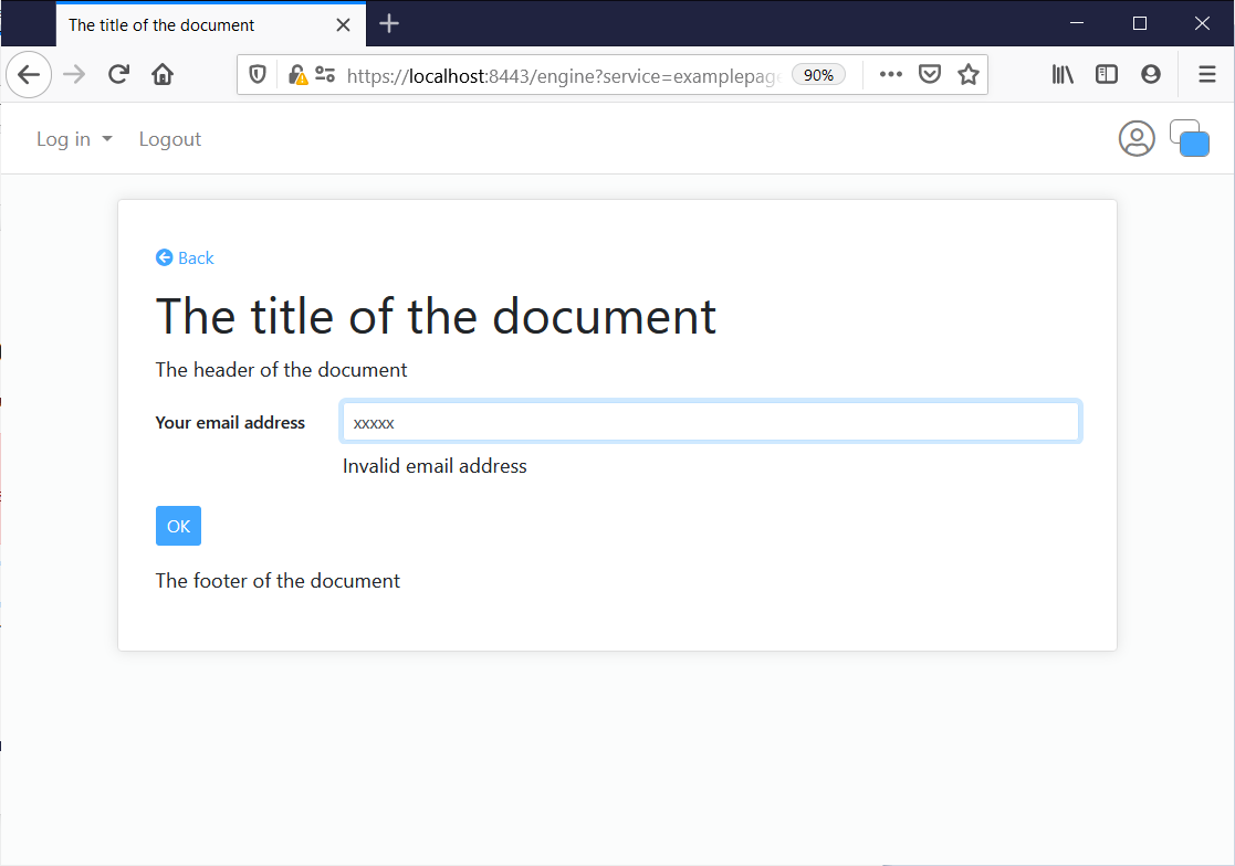
Image: the 'Minimal 'error message mode
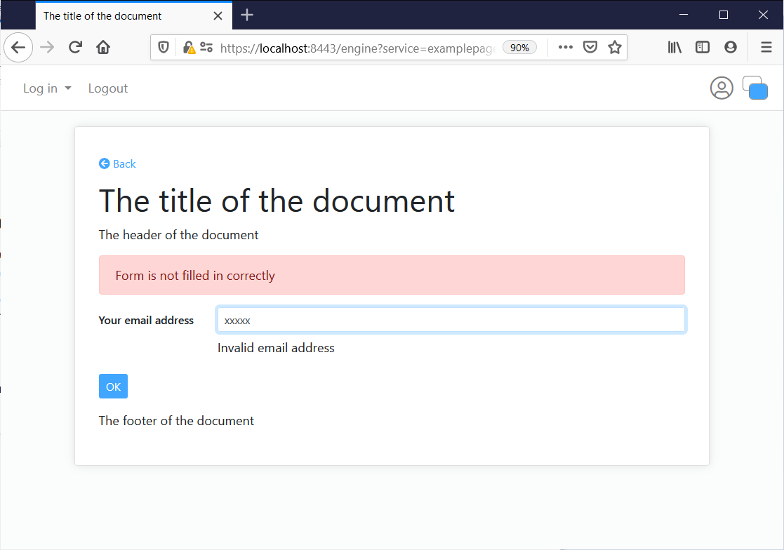
Image: the 'Message only' error message mode
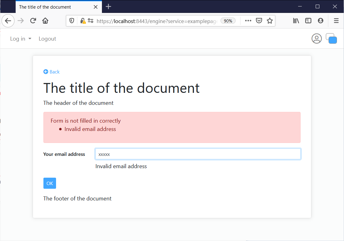
Image: the 'All' error message mode
Modals
On modals the same layout is used, Some notes:
- The title is always in the top-bar of the modal
- The buttons of the form are always in the bottom-bar of the modal at the right side (below the footer).
- A back button is always in the bottom-bar at the left side (if applicable).
- The close button is always at the top right.
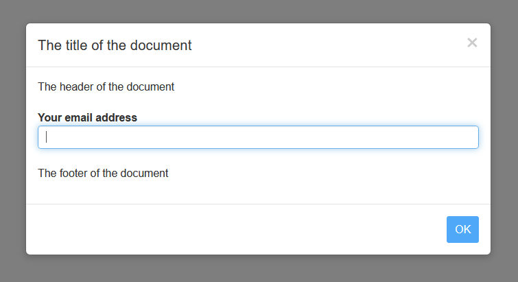
Image: A modal